This system builds directly off the 5-Key Branding (Godai Map). That is where the five elements (Void, Fire, Wind, Water, Earth) define how your brand communicates its soul. While that will add depth, this framework can work independently.
Why Bother with Graphic Design?
Good design focuses the lens of the viewer.
It boosts clarity, intent and function, so more people read, understand, and respond.
Poor design can undermine great art.
Think of that exhibit flyer you never picked up, you’ll never know how good the work was.
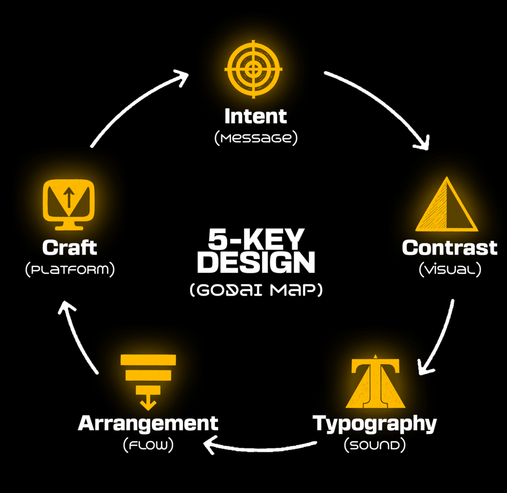
The Map (5-Key Design)
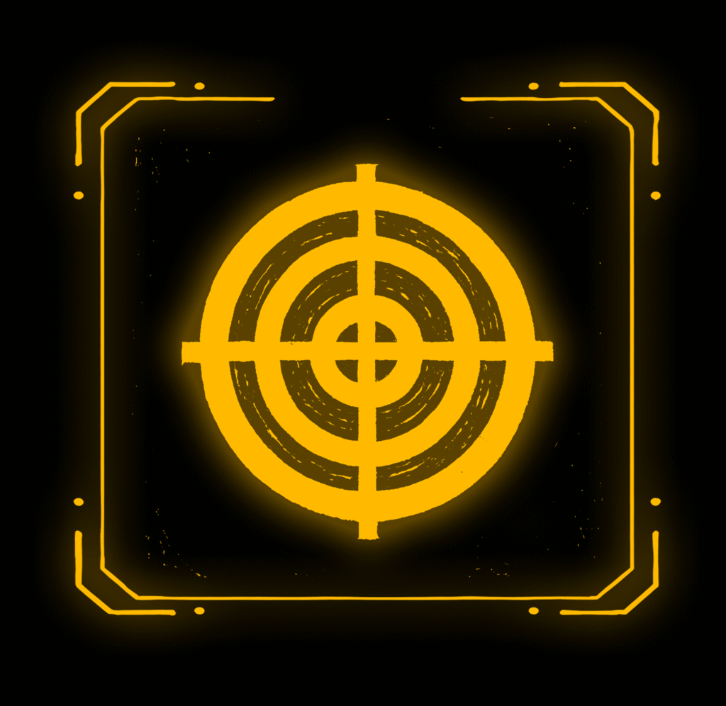
1. MESSAGE→ INTENT
We start withIntent: Specifically intent & imagery. I against I.
No matter the artists intent, the wrong choice of imagery when it comes to a Graphic Design will destroy its function.
Unlike art, in functional design, we don’t leave interpretation up to the viewer. Our goal is take their hand… Tie it to the other, and land the intent.
Define: one action/feeling you want, then choose imagery that makes the intentobvious (style, lighting, texture, symbolism).
Write: a 1-line outcome; then remove anything that doesn’t serve it. Minimalism will be your friend in a world drenched in noise. You can use this, to lead them to the real art.
2. VISUAL→ CONTRAST
If everything shouts, nothing is heard. Contrast is how you control the soundproof room. Light vs. dark, big vs. small, smooth vs. gritty. It’s the hook that stops the scroll and says, “Look here first. then there.”
“But I want balance…” Alright. Balance is how you hide the intent from the audience. Contrast is how you reveal it.
Grey Game: Choose a main character(focal point). Everything else is supporting cast(work in grayscale first) before color temptation kicks in.
Squint test: Shows a clear focal; thumbnail still readable; one accent doing most of the work. Tip: Scale and Spacing are your loudest dials.
Join our skool and share friendly critiques with fellow creators before shipping to the public.
3. SOUND → TYPOGRAPHY
Typographyis your narrator. Serif, sans, mono, each carries an accent.
It can decide whether you’re whispering, lecturing, or casting a spell.
Clarity/Contrastfirst; accent second; then rhythm.
Set the tempo, and the poster breathes. Lose it, and it shrieks.
Clarity: Small screens, low light, pixelation. Your words should survive.
Accent: Know the connotation, the stereotype. Don’t touch comic sans.
Rhythm: Control rhythm with line length and line-height.
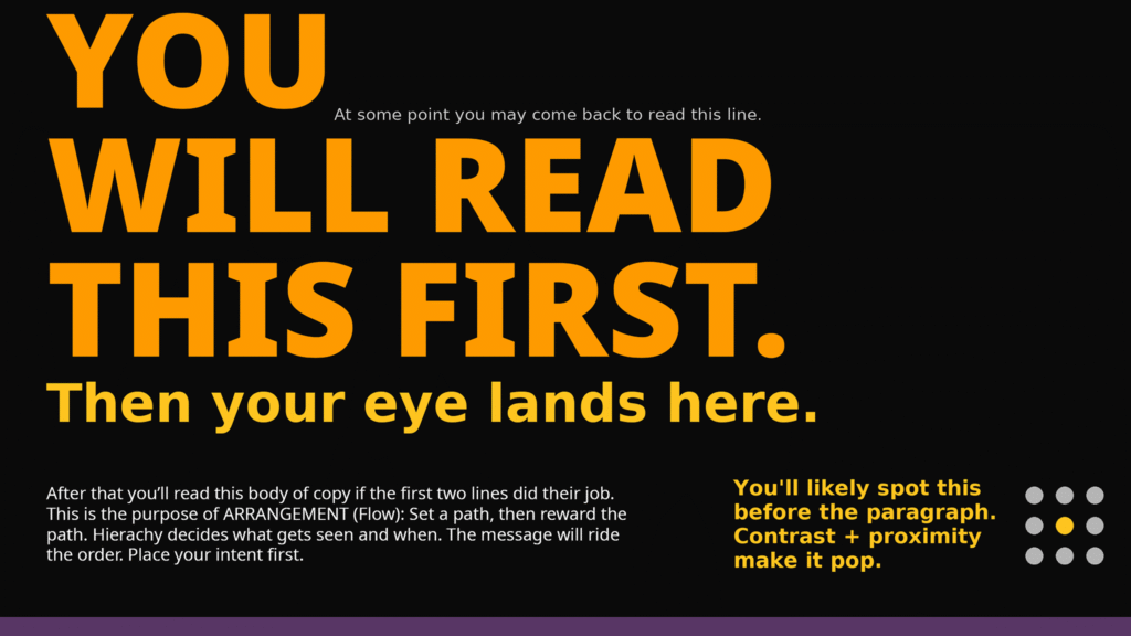
4. FLOW → ARRANGEMENT
Arrangement is choreography for the eye. Don’t break a leg.
The viewer should feel guided, not trapped; museum, not maze.
If your layout needs the paragraph to explain the layout, redesign your layout.
Constraint 1st: Use a design grid to earn your chaos. Break the rules only after you learn the landscape.
Let it breathe: Empty space isn’t empty, it’s tension management.
5. PLATFORM → CRAFT
Craft is where art meets the real world. The specs, the exports, the handoff that keeps your vision intact. The printer is innocent. The algorithm is hungry. Your job is to feed each platform the right meal.
No jokes here. Know your platforms, and protect your craft.
Workflow: Lock production presets when possible (DPI, bleed, RGB/CMYK, subtitle safe areas) and reuse them religiously.
Reality Check: Test the output where it lives (phone, projector, print). Don’t wait until ship date or a day before the event. Deadlines are for the…
Elevate. Together.
Your art already speaks; graphic design is how you amplify it across print, screens, and short-form media. The best way to retain information is to put it into immediate action. Join us in the skool and implement these systems today.